05
Zenagen

Overview
A new visual identity and package design that fuses beauty + science
Challenge
Zenagen is a professional haircare brand focused on reducing hair loss through its all natural plant-based formulas.
What was once a niche market dominated by the likes of brands like Rogaine, had quickly grown into a competitive marketplace attracting a slew of investment backed DTC companies looking to set new standards for a more natural haircare solution that would appeal to a younger more health conscious market.
In order to compete in an evolving marketplace, Zenagen wanted to refresh their brand identity to reflect their professional, high-end science-backed haircare formulas.
Approach
I worked with the Zenagen team to explore a new visual identity and package design system to align with their high-end, boutique 'salon-focused' positioning strategy.
I led the team from the initial sales process through discovery, moodboards, and final production concepts; identifying potential solutions to further simplify their complex product lines through the use of iconography and color, as well as building an overarching visual design language and package design system.
After only 3 weeks, designs were taken in-house to reserve budget and a new distribution strategy to focus on Amazon sales vs DTC prevailed.
Role
Design Direction, Packaging
Design Direction
Direction 01
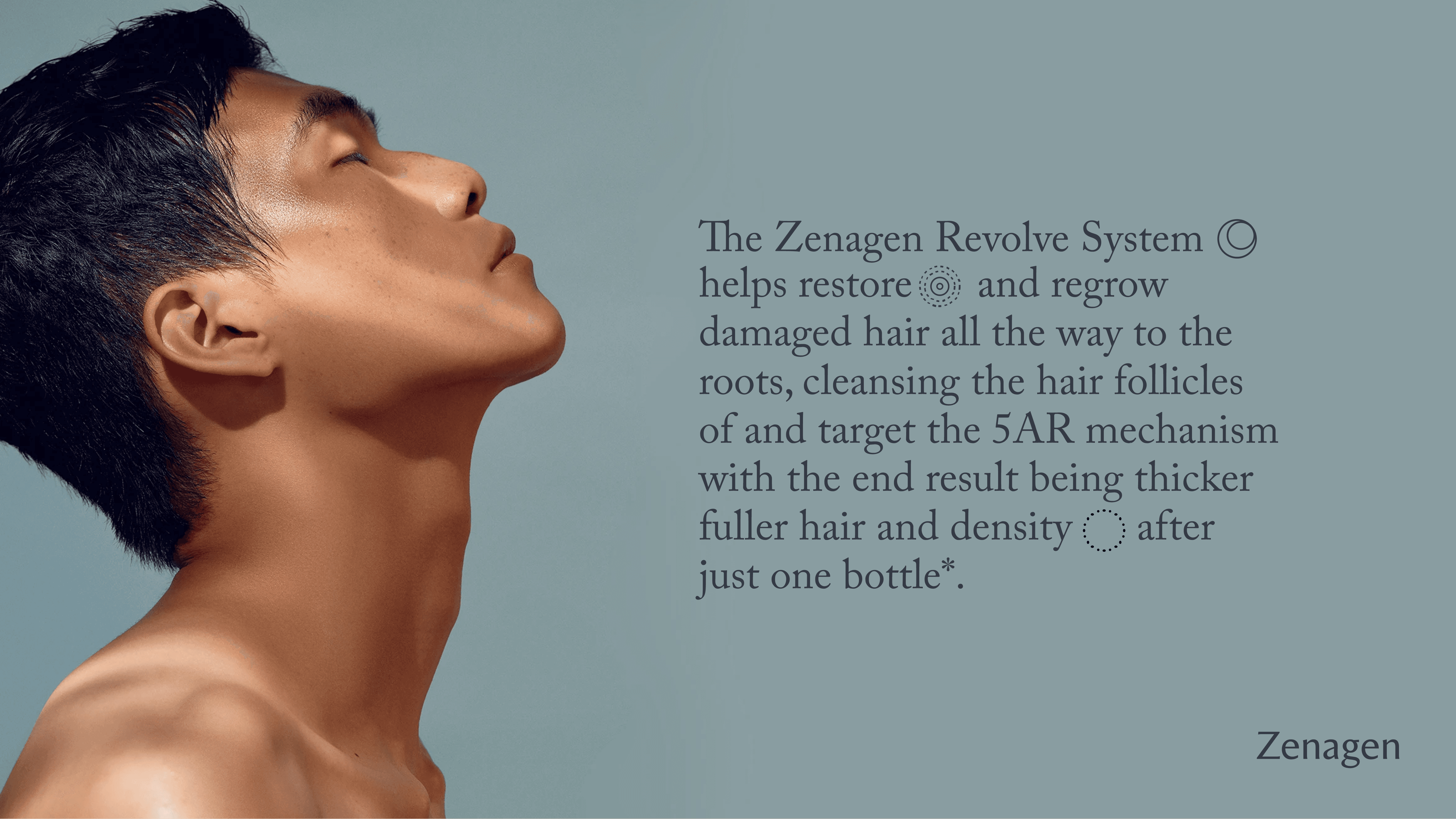
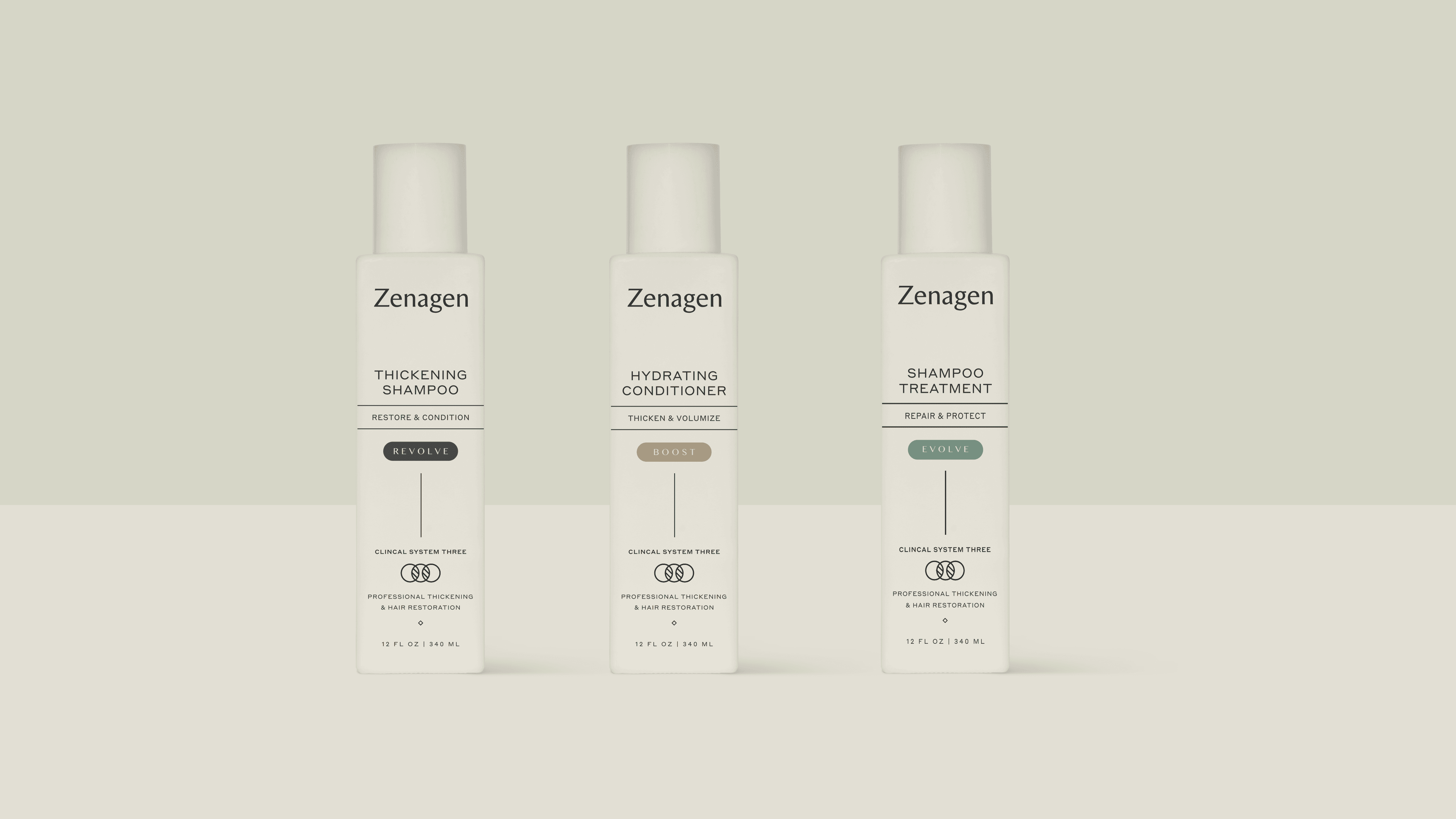
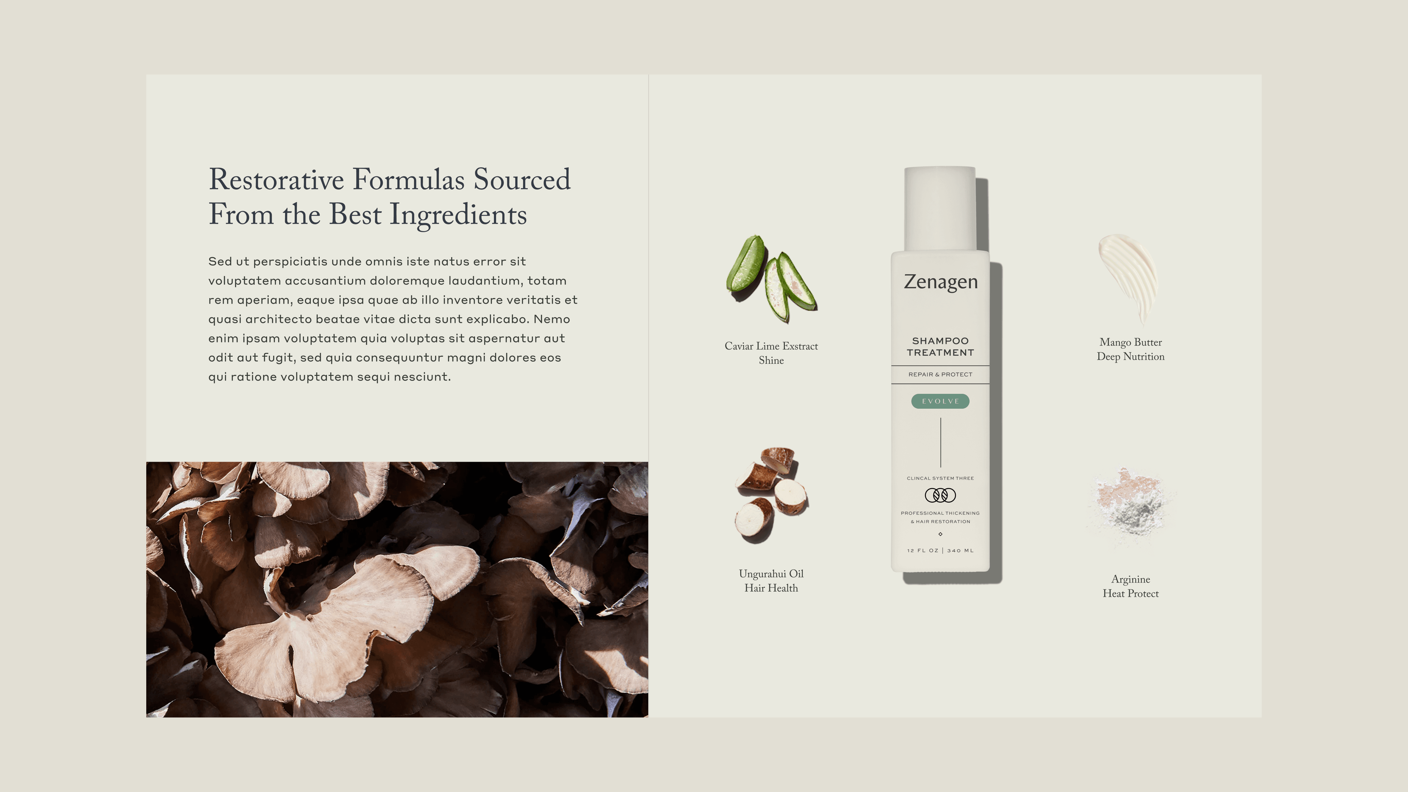
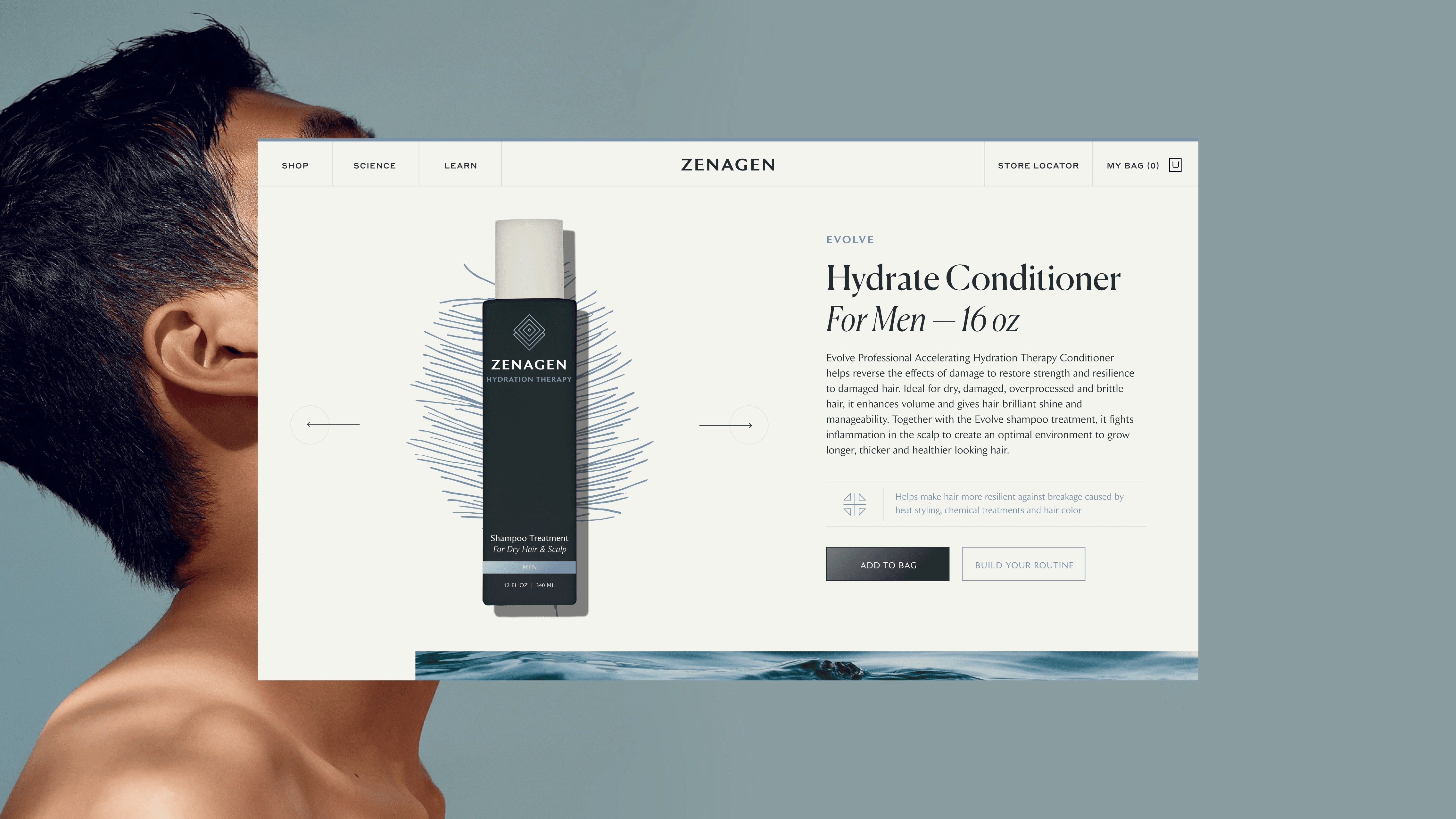
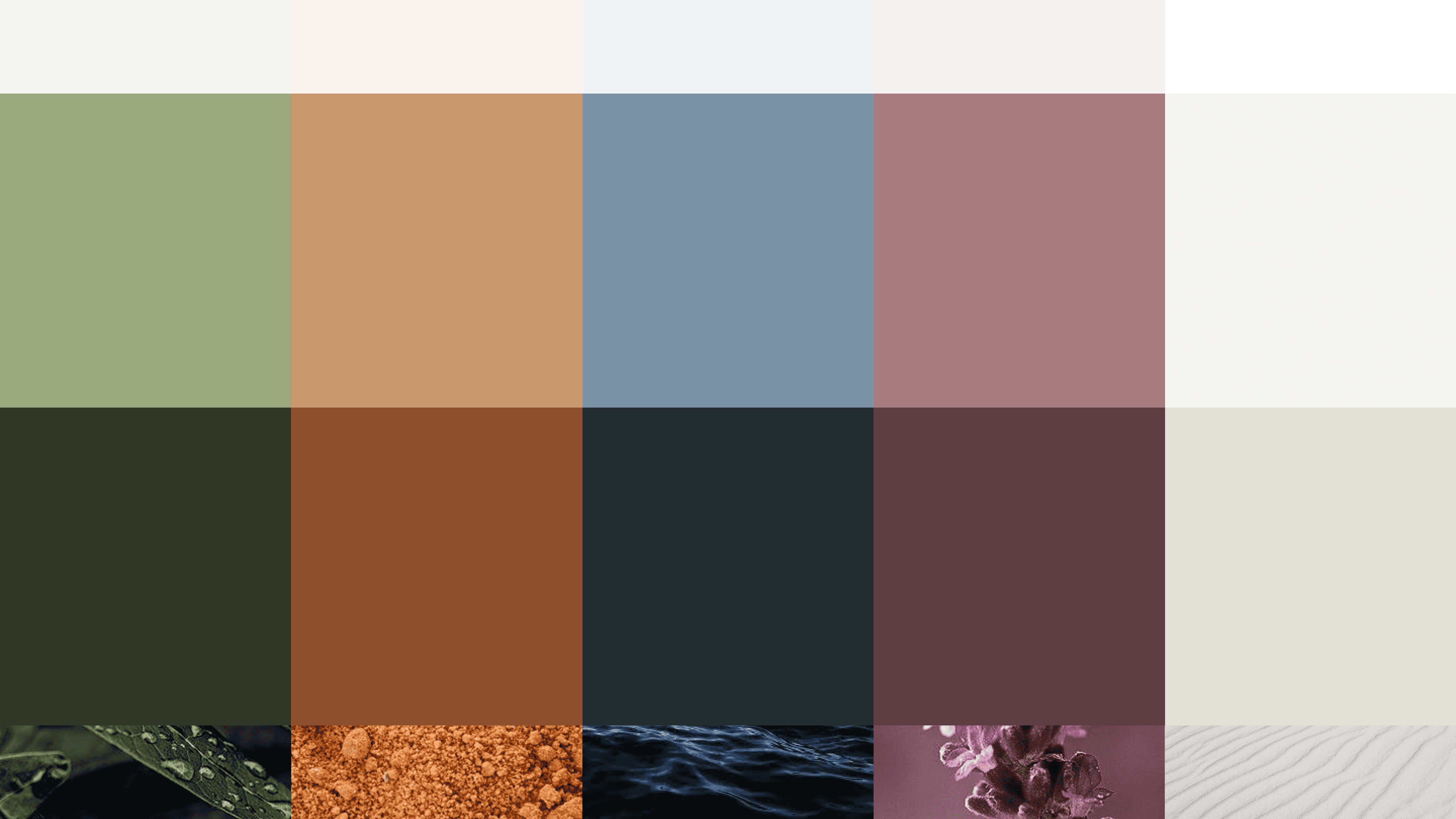
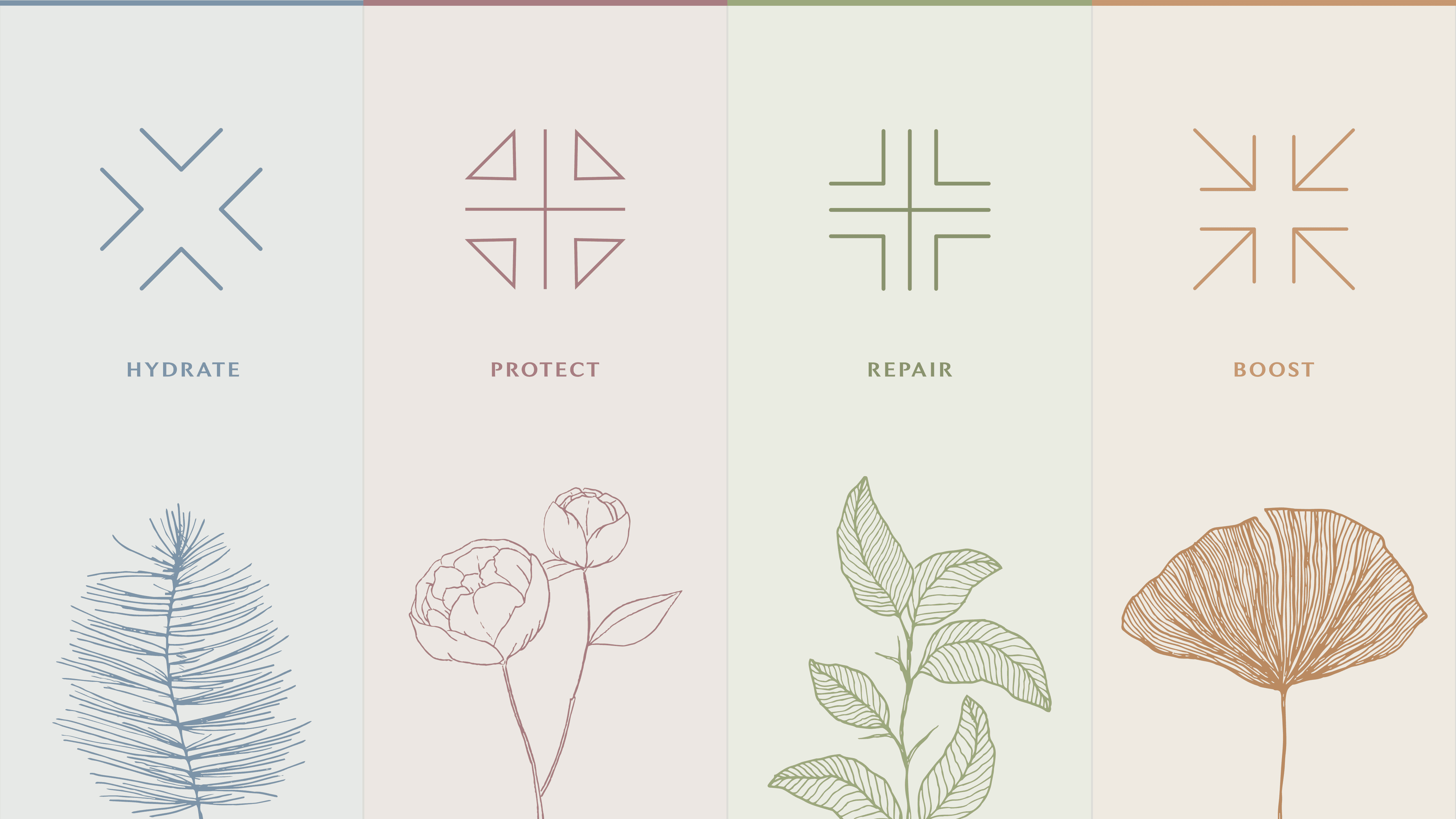
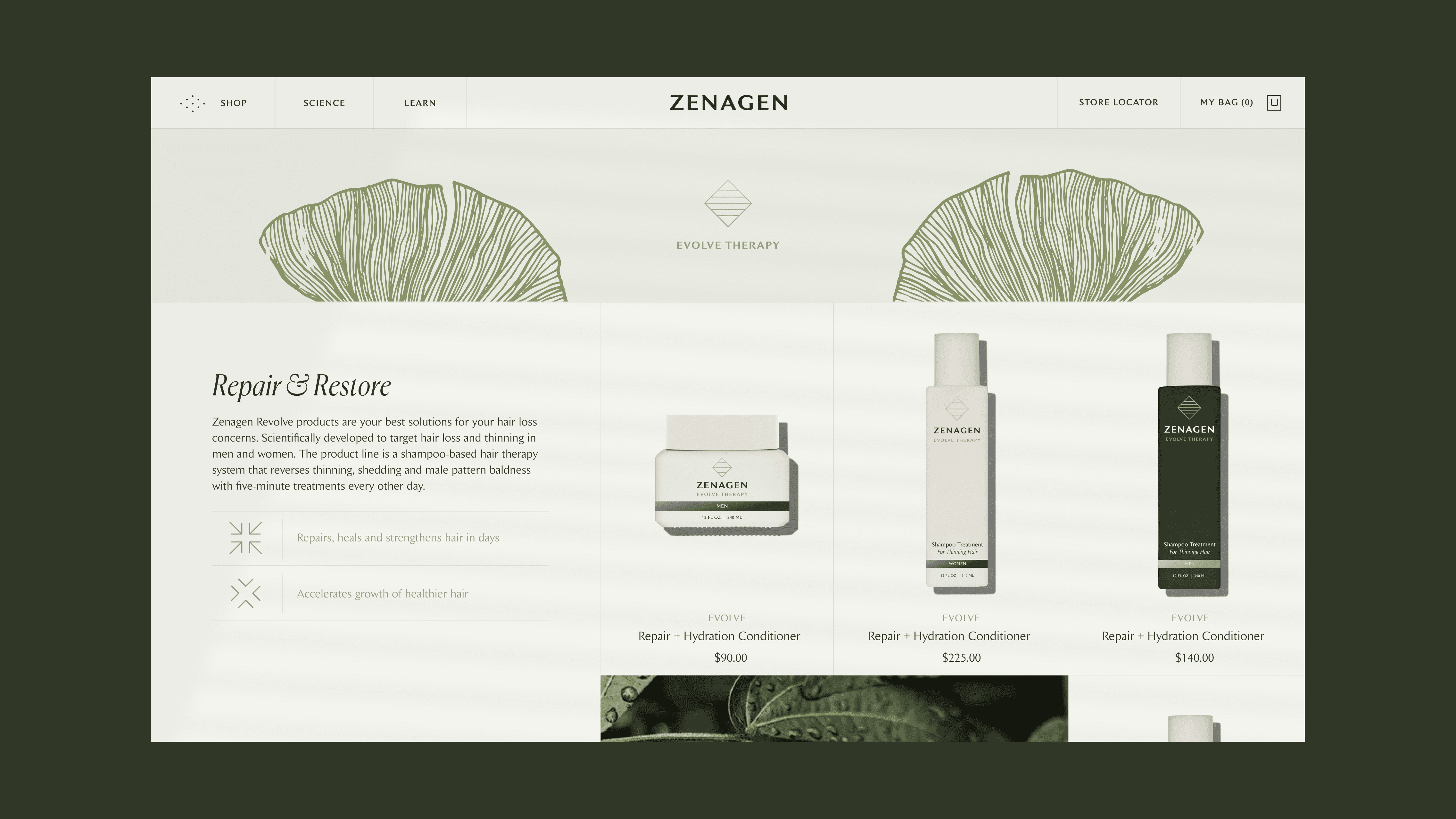
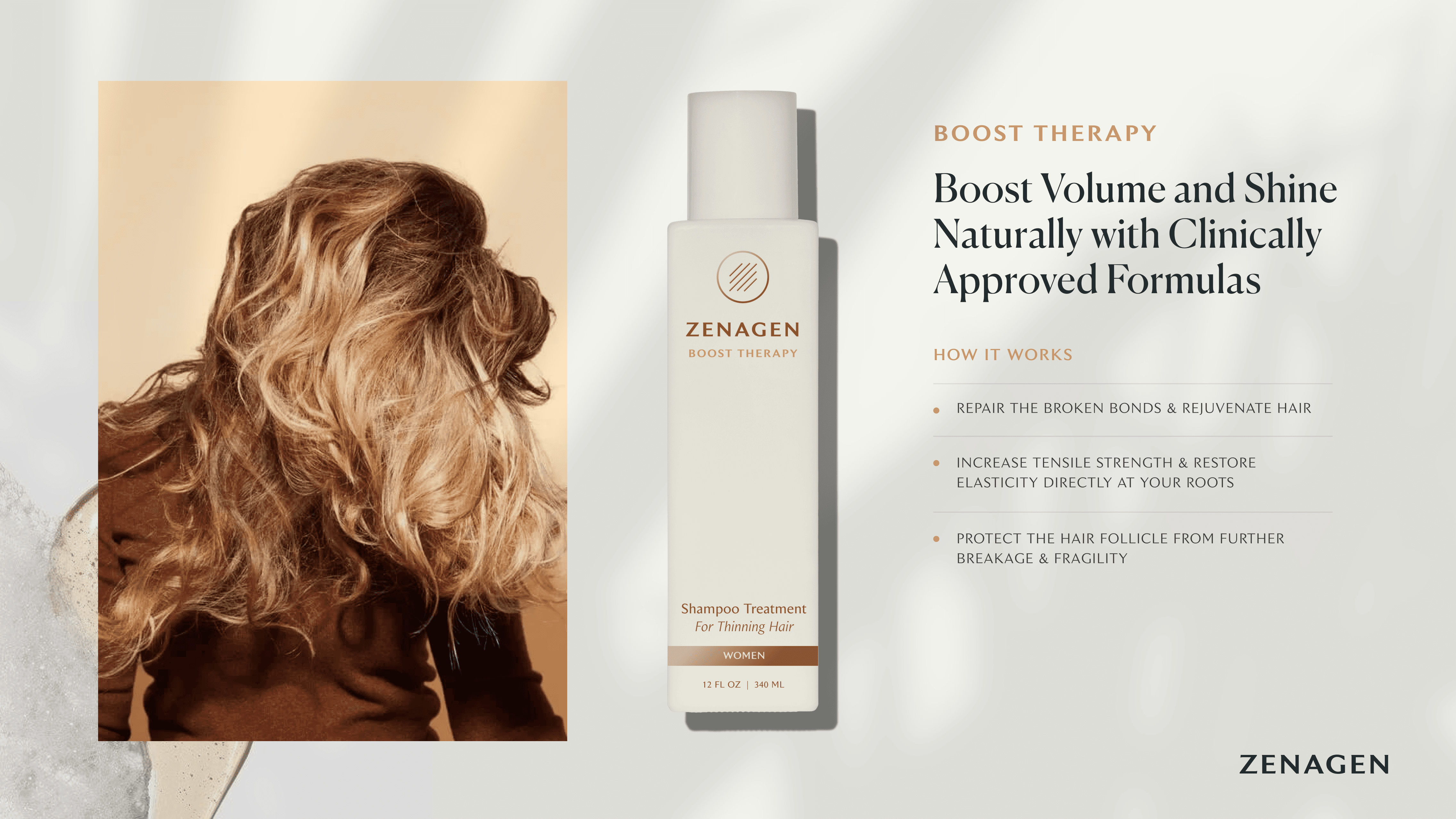
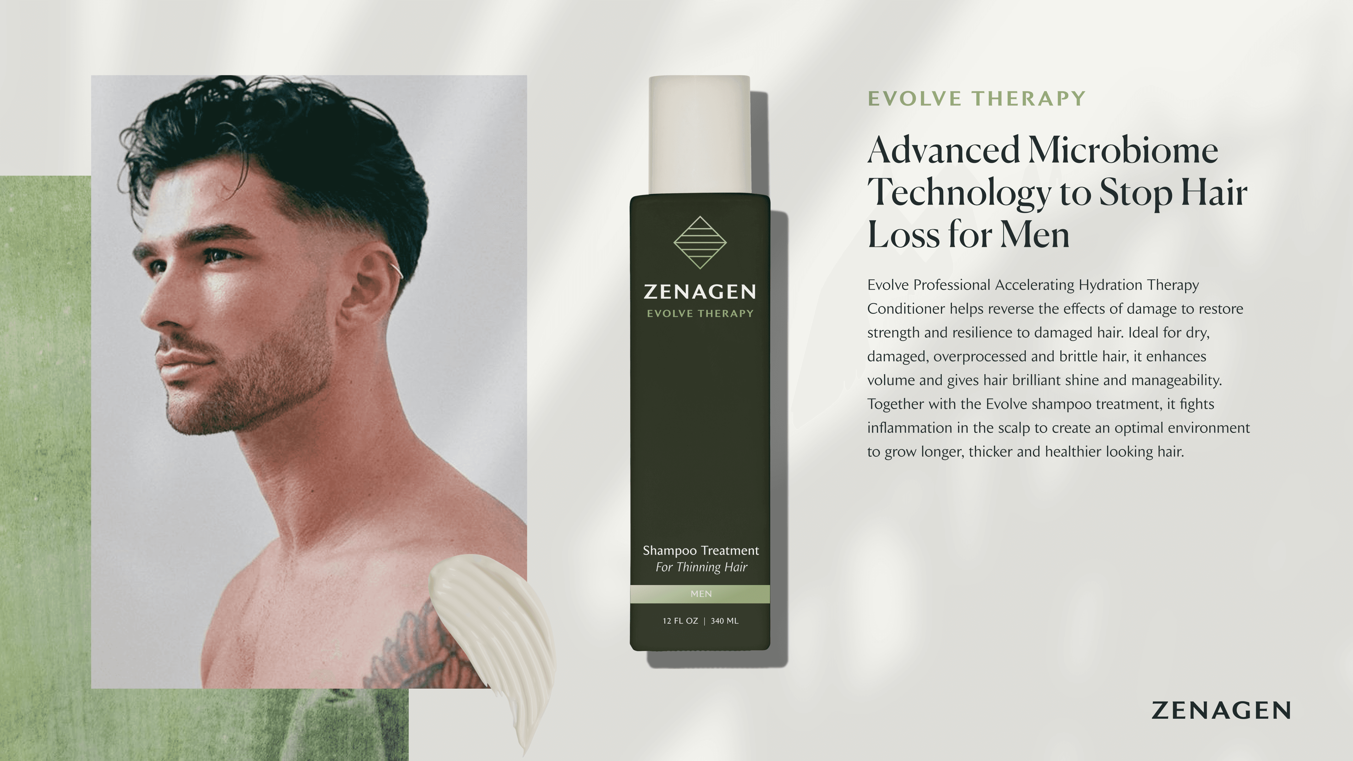
The first direction was intended to further communicate the brands motif, 'The Fusion of Beauty + Science'. The revised wordmark and type pairings brought a sophisticated and organic tone to the brand while giving each product line its own natural color palette, icon, and supporting illustration to visually represent the active plant-based ingredient within each formula.
The first direction was intended to further communicate the brands motif, 'The Fusion of Beauty + Science'. The revised wordmark and type pairings brought a sophisticated and organic tone to the brand while giving each product line its own natural color palette, icon, and supporting illustration to visually represent the active plant-based ingredient within each formula.
The first direction was intended to further communicate the brands motif, 'The Fusion of Beauty + Science'. The revised wordmark and type pairings brought a sophisticated and organic tone to the brand while giving each product line its own natural color palette, icon, and supporting illustration to visually represent the active plant-based ingredient within each formula.







Design Direction
Direction 02
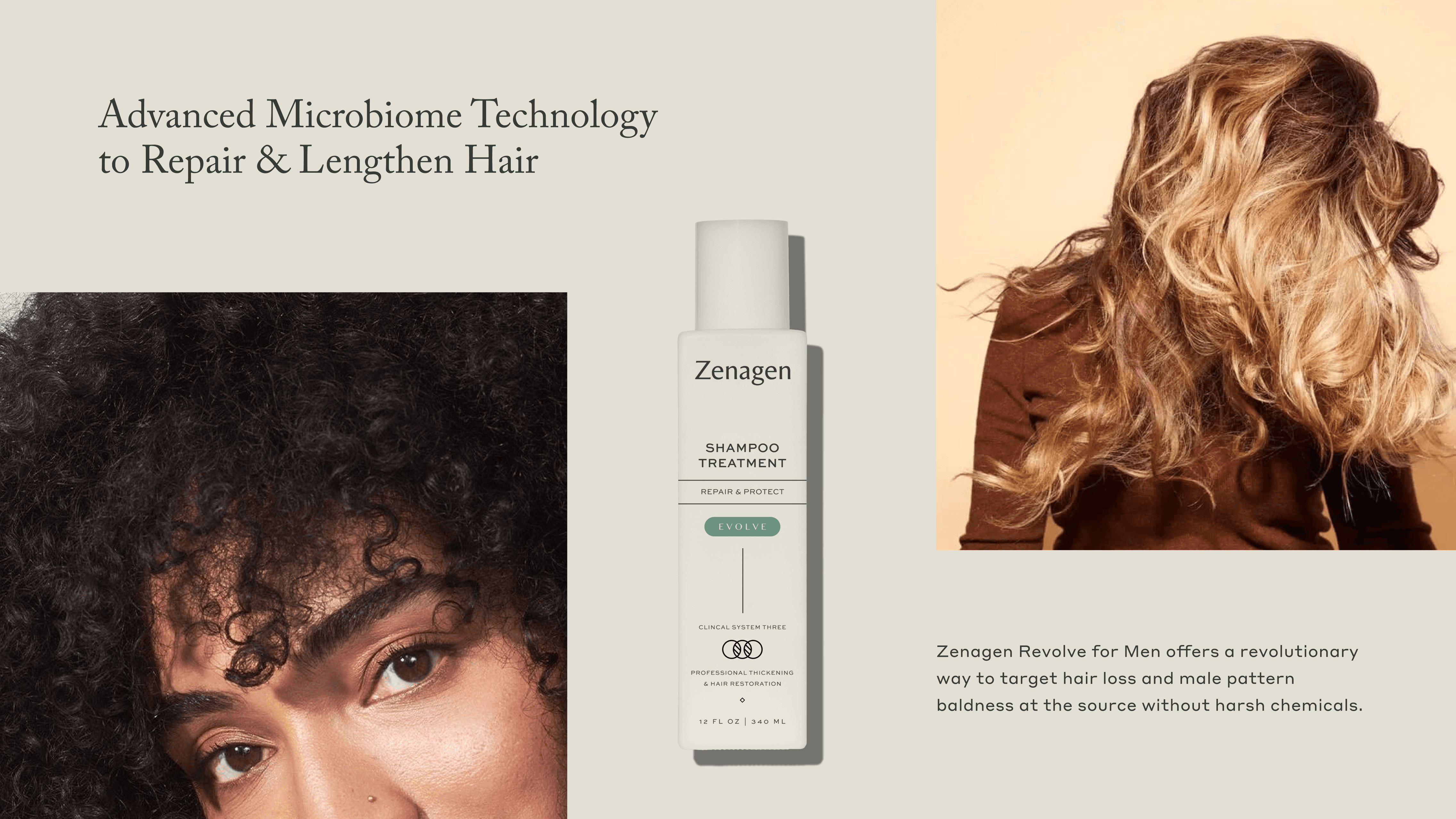
The second direction takes a much more defined stance towards clean beauty. It's inclusive, but highly tailored towards being a disruptor in the space as the most trusted plant-focused performance hair care brand in the market.
The second direction takes a much more defined stance towards clean beauty. It's inclusive, but highly tailored towards being a disruptor in the space as the most trusted plant-focused performance hair care brand in the market.
The second direction takes a much more defined stance towards clean beauty. It's inclusive, but highly tailored towards being a disruptor in the space as the most trusted plant-focused performance hair care brand in the market.


